This is the english version of the article, to the german version.
On 17th of May, we had a very special guest at out MeetUp: Chloe Tseng (Twitter: @DataChloe). She is Tableau Zen Master and founder of the project VizforSocialGood.
She talked about data visualization and storytelling with data, and she also explained why some visualizations are so effective, and others are not. There are three main points she talked about:
Memorize
Use some photo, annotation or icon – this will make your visualization unforgettable!
We remember the chart longer and recognize it faster if we see something and we have any association with it.
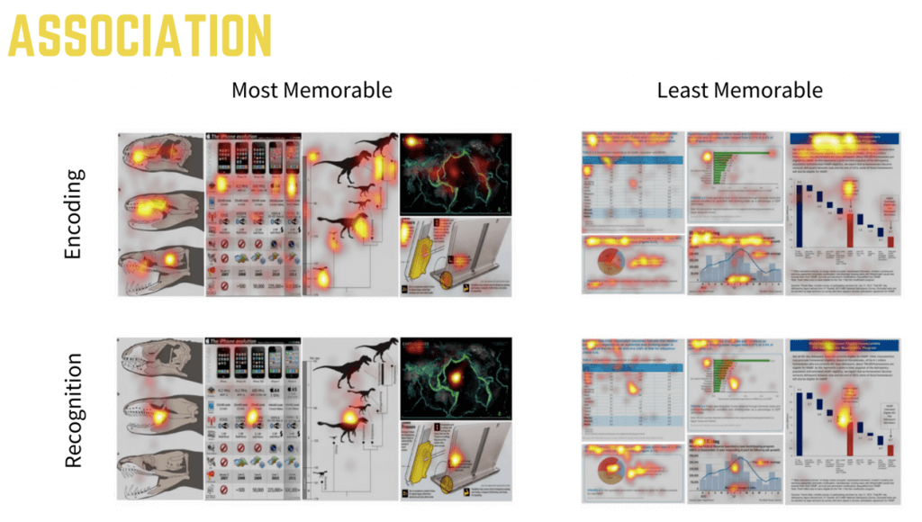
These statements were supported by the study on Eye-Tracking, which was carried out in Massachusetts. The research team gained data for a total of 393 visualizations and 33 viewers, with an average of 16 viewers per visualization.
Each viewer looked at each visualization (see the charts below) for 10 seconds, generating an average of 37 fixation points. This is a total of about 600 fixation points per visualization across all viewers.
The results of this study have shown two interesting conclusions:
- viewers need fewer fixations on visualizations with pictures compared to visualizations without them.
- infographics/dashboards with pictures are more memorable than those without pictures.
Check out this infographic by Adam Crahen as a good example.
Reveal
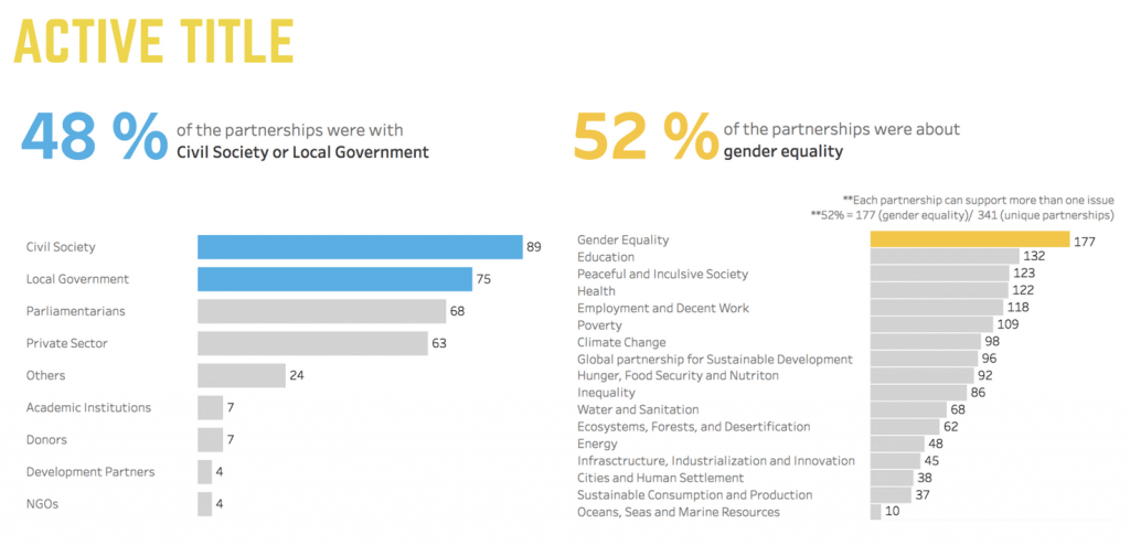
If you have a message for your audience, then reveal this message!
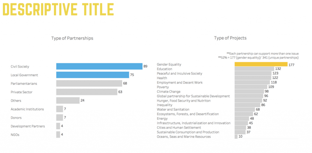
The dashboard below shows two bar charts. At first sight, you probably would say that the dashboard is well built: The designer used few colors and only emphasized the relevant info with color.
However, from an external viewpoint, it might be hard to understand the message of this dashboard. Help your audience to get the message quickly – reveal the message!
Consume
Try to understand how your audience consumes your visualization!
Preattentive attributes will help you. Preattentive attributes determine which information will catch our attention. This is important in visualization because it enables us to direct our viewer’s attention towards the most important information in our visual. Here are some examples:
On this chart, you can immediately see that every section has one point in it which differs from the others, regarding position, shape, color etc. These are preattentive attributes.
With preattentive attributes, it will be possible to draw the attention of your audience to some specific point.
The chart below has no preattentive attributes. Your audience will need some time to understand what kind of crisis this is. Maybe not everyone knows where South Sudan is located on the map?
Use color as the preattentive attribute, as on the chart below:

In a few seconds, you realize what kind of crisis is this and where it did happen because the most important points are colored.
Here you can find the original presentation of Chloe: VFSG_EURO
Want to know more about our meetups? Check out our meetup page.


